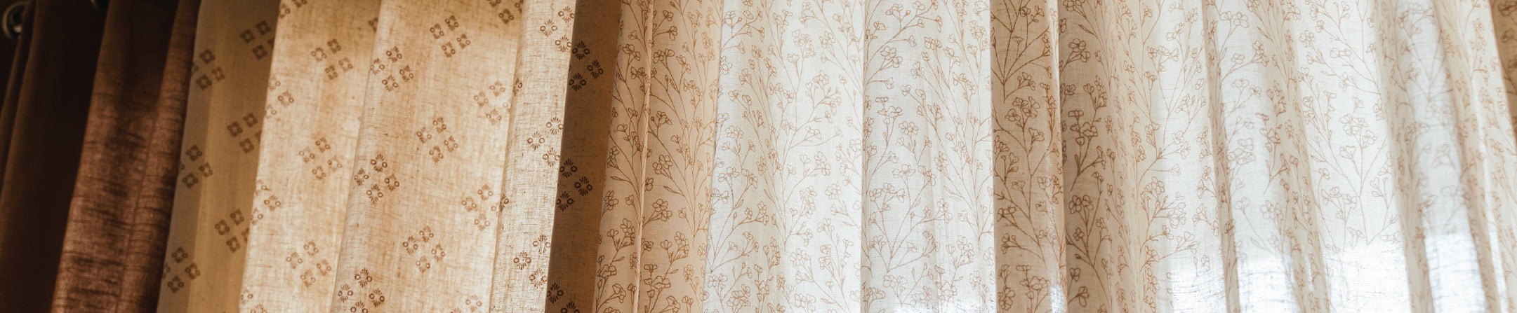

A beautiful pair of curtains can transform a room. So can a set of cushions. Put the wrong ones together, though, and suddenly there is too much colour, too many prints and no clear place for the eye to rest.
The answer is not to make everything match. It is to create enough connection between your curtains, cushions and the rest of the room for them to feel like they belong together.
Natural fabrics make this particularly easy. Cotton curtains, linen textures and thoughtfully chosen cushion covers bring softness to a room without demanding too much attention. And if you are unsure how a fabric or colour will actually work with your sofa, walls and daylight, Natural fabrics make this particularly easy. Cotton curtains, linen textures and thoughtfully chosen cushion covers bring softness to a room without demanding too much attention.
If you are unsure how a fabric or colour will actually work with your sofa, walls and daylight, The Yellow Dwelling’s ₹499 Expert Home Service can help with professional measurements, cotton and linen fabric selection, and choosing the right custom-made curtains or blinds at home.
Start With the Room

Before choosing a new cushion because it looks beautiful next to a curtain online, look at everything that will surround it.
What colour is your sofa? Are your walls warm white, grey, beige or something stronger? Is there already a patterned rug? What about wooden furniture, artwork or a statement chair?
These elements create the visual foundation of the room.
If your sofa, rug and artwork already introduce several colours, your cotton window curtains and cushions may need to be quieter. In a largely neutral room, on the other hand, the curtains or cushions can introduce more personality.
Natural light matters too. A pale sage or beige can appear considerably brighter in a sunny living room than it does in a room that receives indirect light. This is one reason seeing fabric swatches in the actual room can be more useful than judging colour from a screen alone.
Choose One Anchor Piece for Your Colour Palette
Start with the largest or least likely element to change. This could be your sofa, rug or curtains.
Imagine a living room with a beige sofa. Instead of adding unrelated colours one by one, you could introduce muted green through the curtains and repeat a softer version of the same green in one or two cushion covers. Add ivory or beige cushions alongside them, and the arrangement begins to feel connected without looking overly coordinated.
The aim is to build around an anchor, rather than asking every decorative piece to compete for attention.
Follow the 60-30-10 Colour Rule for a Balanced Look
The familiar 60-30-10 decorating guideline is useful when a room starts feeling visually confusing.
Think of roughly:
-
60% as the dominant colour: walls, flooring or a large sofa
-
30% as the secondary colour: curtains, an armchair, rug or other larger furnishings
-
10% as an accent: cushion covers, artwork and smaller decorative pieces
It does not need to be mathematically exact.
The value of the rule is that it prevents curtains and cushions from being treated as two isolated decorating projects. If muted blue curtains are already providing the room's secondary colour, for instance, you may only need a couple of smaller blue accents on the sofa rather than covering it in matching blue cushions.
This also gives patterned cotton curtains for home enough room to be appreciated.
Five Curtains and Cushion Covers Combinations That Look Effortlessly Coordinated
There is no universal combination that suits every living room, but these palettes offer useful starting points for contemporary Indian homes.
1. Ivory Curtains With Sage Green and Beige Cushions
Ivory and soft off-white curtains create a quiet background, particularly in rooms that already receive plenty of daylight.
Bring in sage green through one or two cushion covers, then soften the arrangement with beige or cream. The greenery-inspired palette feels fresh without creating a hard contrast.
A combination like this works especially well with light or medium wood, cane details, indoor plants and warm neutral walls.
The Yellow Dwelling's current cushion collection includes sage-green options such as its Gingham Cotton cushion cover, along with solid and printed natural-fabric designs that can be layered with quieter curtains.

2. Beige Linen Curtains With Rust and Terracotta Cushions
Beige curtains already bring warmth into a space, so they pair naturally with earthy shades rather than sharp contrasts.
Try rust, terracotta, muted ochre and warm brown cushion covers against the neutral curtain base. Keep at least one or two cushions plain so the sofa does not become a row of competing patterns.
This combination works particularly well in rooms with wooden furniture, woven accessories and warm lighting.
The Yellow Dwelling's collection currently includes Solid Rust cotton cushion covers as well as rust-and-beige combinations, giving you the option of carrying the palette through without repeating an identical design.
3. Subtle Floral Curtains With Solid-Coloured Cushions

Printed curtains do not automatically mean you need plain beige cushions.
Instead, look closely at the curtain.
A floral design may contain green leaves, a muted yellow flower, a dusty blue detail or a warm neutral background. Pick one of the less dominant colours and repeat it through a solid cushion cover.
The connection will be noticeable without looking overly deliberate.
For example, The Yellow Dwelling's Wild Bouquet cotton curtain brings a floral pattern to the window. A simple solid cushion that picks up one of the quieter colours in a similar floral palette would allow the curtain to remain the main patterned feature.
4. Muted Blue Curtains With Off-White and Sand Cushions

Blue can become visually dominant surprisingly quickly, especially across large windows.
Instead of matching blue curtains with a full collection of blue cushions, surround the colour with warm neutrals.
Off-white, sand, beige and light taupe cushion covers can soften the blue while keeping the room airy. One smaller cushion may repeat the curtain shade or introduce a fine blue print to connect the sofa to the window.
The result feels relaxed without turning the entire room into a single-colour scheme.
5. Neutral Cotton Curtains With One Statement Printed Cushion

This is one of the easiest combinations for a room that already has artwork, a colourful rug or decorative furniture.
Choose understated cotton curtains in cream, white, beige or another soft neutral. Keep most cushions restrained and introduce just one stronger printed design.
It works particularly well in compact rooms because the statement print has space around it.
The Yellow Dwelling offers plain and printed cotton curtains, along with linen options and coordinating cushion covers. This makes it easier to build combinations through natural texture and colour rather than filling every surface with a different pattern.
How to Mix Prints Without Making the Room Feel Crowded

Print-on-print styling can look thoughtful and layered, but it needs hierarchy.
The problem usually begins when every print is equally bold.
A large floral, wide stripe and strong geometric pattern placed together can all demand attention at once. Instead, decide which furnishing should lead and which should support it.
Let Either the Curtains or Cushions Carry the Boldest Print
If your cotton curtains feature a distinctive floral, ikat or geometric print, give the sofa some breathing space with mostly solid or finely patterned cushions.
The opposite works too.
Plain cotton curtains can form a calm backdrop for stronger cushion covers. This is particularly useful if you like changing cushions seasonally because the curtains remain versatile.
The Yellow Dwelling's Laya curtain, for example, uses an ikat-inspired geometric print in multiple colours. With a curtain like this, quieter cushions would keep the room balanced while allowing the design at the window to remain noticeable.
Mix Large and Small Patterns Instead of Similar-Sized Prints
Pattern scale matters almost as much as colour.
Suppose your curtains feature broad botanical motifs. Pairing them with another equally large floral can make the room look unsettled.
A small geometric, narrow stripe or textured solid works better because the eye can distinguish the hierarchy between the two.
Likewise, a large-print statement cushion can sit comfortably against curtains with a very fine repeated motif.
The prints do not have to come from the same collection. They simply need enough difference in scale to avoid fighting each other.
Repeat One Colour to Connect Different Designs
When combining two prints, search for a common colour.
You might pair floral curtains containing muted green leaves with a geometric cushion that uses the same green among other neutral shades. The patterns can be completely different because the repeated colour creates the connection.
This is usually more interesting than buying curtains and cushion covers in an identical print.
Use Cotton and Linen Textures to Add Interest Without More Prints
A room does not need another pattern every time it needs more depth.
Texture can do much of that work.
Cotton has a natural softness and relaxed surface character, while linen and cotton-linen blends introduce additional visual texture. Their matte finish also sits comfortably alongside wood, cane, ceramics and other materials commonly used in Indian interiors.
This is particularly useful when working with a limited palette.
Picture beige cotton curtains beside a cream sofa. Instead of introducing three patterned cushions simply because the colours are similar, combine a plain cotton cushion with a linen-textured one and one restrained print.
The differences in weave keep the arrangement interesting.
The Yellow Dwelling centres its curtain collection around natural fabrics, including cotton and linen, with solid, floral and geometric options available across the range.
Some current cotton curtains, such as Kaanta, are also designed as sheerer, light-filtering options, while other designs can be selected with different lining choices depending on the amount of light control required.
That variety is important when shopping for cotton curtains in India, where the same decorating approach may not suit every window, orientation or room.
Match Cushion Styling to the Visual Weight of Your Curtains
One decorating principle that is easy to overlook is visual weight.
Full-length curtains already occupy a substantial part of the wall. Add generous gathers, a strong print and a deep colour, and the window becomes one of the room's largest visual features.
The cushions do not need to compete with it.
With prominent curtains, keep the sofa styling comparatively restrained. Choose fewer colours and allow plain fabrics to separate prints.
If your curtains are simple and neutral, the sofa can carry more decoration. You might introduce a floral cushion, a geometric lumbar cushion and one or two solids while still maintaining balance.
Balance Cushion Sizes, Shapes and Placement
More cushions do not automatically make a sofa look more styled.
Use proportion instead.
Larger cushions can create the foundation at either end of a sofa, with a smaller square or lumbar cushion adding variation. Leave some upholstery visible so the arrangement feels intentional rather than packed.
A compact two-seater may need only a few carefully selected pieces, whereas a long sectional offers more room to repeat colours and vary scale.
Adjust Your Combination for Small and Large Living Rooms
Room size changes how much colour and pattern the eye can comfortably absorb.
In a compact living room, lighter cotton curtains for home or softly textured linen curtains can help keep the window visually relaxed.
Maintaining some similarity between the sofa, curtain and wall tones can also reduce visual fragmentation.
A larger living room gives you more room to repeat accents.
If one seating area contains rust cushions, for instance, the same rust could reappear in a cushion on an occasional chair across the room. It does not need to appear everywhere. Strategic repetition is enough to connect different zones.
The same principle works with prints. A strong curtain pattern may be balanced by a related colour at the opposite side of a larger room rather than being repeated directly on the sofa.
A Simple Three-Step Test Before You Finalise Your Furnishings
Before ordering an entire curtain-and-cushion combination, try this quick test.
1. Check the colours together in your room
Compare samples or furnishings under your home's actual daylight. Warm artificial lighting and bright afternoon sun can make the same colour appear very different. This is also where an at-home consultation can be useful, since cotton and linen swatches can be viewed against your existing sofa, wall colour and natural light before you finalise the curtains or blinds.
2. View everything from a distance
Take several steps back. Does your eye immediately land on one overwhelming pattern? Do both the curtains and sofa seem to be fighting for attention?
Distance often reveals imbalance that is difficult to notice while arranging individual pieces.
3. Remove one competing element
If something feels too busy, do not start over immediately.
Remove one patterned cushion. Replace one strong colour with a neutral. Simplify one decorative element and look again.
Very often, good styling is not about adding the missing item. It is about recognising the item you did not need.
Bring the Whole Look Together With The Yellow Dwelling

Matching curtains and cushions becomes much easier when you work with a consistent material and colour story.
The Yellow Dwelling offers cotton and linen curtains alongside cushion covers in solids, florals, geometrics and softer printed designs. Rather than recreating the same pattern throughout a room, you can use complementary shades and natural textures to create a more layered result.
If you are finding it difficult to judge fabrics online, The Yellow Dwelling’s ₹499 Expert Home Service offers an easier way to choose at home. An expert can take professional window measurements, bring cotton and linen fabric swatches, and help you select suitable custom-made curtains or Roman blinds based on your room, window size, daylight and existing décor.
This can be especially useful when you are furnishing several windows, need custom-made curtains or blinds, or want to see how a cotton or linen fabric will sit alongside an existing sofa, rug and wall shade.
Whether you prefer understated cotton window curtains, soft florals or earthy linen textures, start with the room you already have and let each new furnishing build on it.
Final Thoughts
Matching curtains and cushions does not mean choosing identical fabrics, colours or prints.
The most inviting rooms usually have enough repetition to feel connected and enough variation to feel lived in.
Start with a limited palette. Give one print permission to lead. Use solids and natural textures to create breathing room. And remember that cotton and linen curtains can become either the quiet backdrop or the defining feature of your living room, while custom-made Roman blinds can offer a cleaner solution for compact windows